:root { --charcoal: #1A1A2E; --charcoal-light: #2D2D44; --charcoal-mid: #3A3A55; --coral: #FF6B4A; --coral-light: #FF8A70; --coral-dark: #E5553A; --cream: #FFF8F5; --white: #FFFFFF; --gray-100: #F7F7F8; --gray-200: #E8E8ED; --gray-300: #C4C4D0; --gray-500: #8888A0; --gray-700: #4A4A60; } *, *::before, *::after { margin: 0; padding: 0; box-sizing: border-box; } html { scroll-behavior: smooth; font-size: 16px; } body { font-family: 'Inter', -apple-system, sans-serif; color: var(--charcoal); background: var(--cream); overflow-x: hidden; line-height: 1.6; } h1, h2, h3, h4, h5, h6 { font-family: 'Space Grotesk', sans-serif; line-height: 1.1; } /* ─── NAVBAR ─── */ .navbar { position: fixed; top: 0; left: 0; right: 0; z-index: 1000; padding: 1rem 2rem; transition: all 0.4s cubic-bezier(0.22, 1, 0.36, 1); } .navbar.scrolled { background: rgba(26, 26, 46, 0.95); backdrop-filter: blur(20px); padding: 0.7rem 2rem; box-shadow: 0 4px 40px rgba(0,0,0,0.3); } .nav-inner { max-width: 1280px; margin: 0 auto; display: flex; align-items: center; justify-content: space-between; } .nav-logo { display: flex; align-items: center; gap: 0.6rem; text-decoration: none; } .nav-logo-icon { width: 40px; height: 40px; background: var(--coral); border-radius: 10px; display: flex; align-items: center; justify-content: center; transition: transform 0.3s ease; } .nav-logo:hover .nav-logo-icon { transform: rotate(-10deg) scale(1.05); } .nav-logo-icon svg { width: 22px; height: 22px; } .nav-logo-text { font-family: 'Space Grotesk', sans-serif; font-weight: 700; font-size: 1.4rem; color: var(--white); letter-spacing: -0.02em; } .nav-links { display: flex; align-items: center; gap: 2rem; list-style: none; } .nav-links a { color: rgba(255,255,255,0.75); text-decoration: none; font-size: 0.9rem; font-weight: 500; transition: color 0.3s ease; position: relative; } .nav-links a::after { content: ''; position: absolute; bottom: -4px; left: 0; width: 0; height: 2px; background: var(--coral); transition: width 0.3s ease; } .nav-links a:hover { color: var(--white); } .nav-links a:hover::after { width: 100%; } .nav-cta { background: var(--coral) !important; color: var(--white) !important; padding: 0.6rem 1.4rem; border-radius: 50px; font-weight: 600 !important; transition: all 0.3s ease !important; } .nav-cta::after { display: none !important; } .nav-cta:hover { background: var(--coral-light) !important; transform: translateY(-2px); box-shadow: 0 8px 25px rgba(255, 107, 74, 0.4); } .mobile-toggle { display: none; flex-direction: column; gap: 5px; cursor: pointer; background: none; border: none; padding: 4px; } .mobile-toggle span { width: 26px; height: 2.5px; background: var(--white); border-radius: 2px; transition: all 0.3s ease; } .mobile-toggle.active span:nth-child(1) { transform: rotate(45deg) translate(5px, 5px); } .mobile-toggle.active span:nth-child(2) { opacity: 0; } .mobile-toggle.active span:nth-child(3) { transform: rotate(-45deg) translate(5px, -5px); } /* ─── HERO ─── */ .hero { min-height: 100vh; background: var(--charcoal); position: relative; display: flex; align-items: center; overflow: hidden; padding: 8rem 2rem 4rem; } .hero-bg-shapes { position: absolute; inset: 0; pointer-events: none; overflow: hidden; } .hero-shape { position: absolute; border-radius: 50%; filter: blur(80px); opacity: 0.15; } .hero-shape-1 { width: 600px; height: 600px; background: var(--coral); top: -200px; right: -100px; animation: float1 8s ease-in-out infinite; } .hero-shape-2 { width: 400px; height: 400px; background: #FFB347; bottom: -100px; left: -50px; animation: float2 10s ease-in-out infinite; } .hero-shape-3 { width: 200px; height: 200px; background: var(--coral-light); top: 40%; right: 30%; animation: float3 6s ease-in-out infinite; } @keyframes float1 { 0%, 100% { transform: translate(0, 0) scale(1); } 50% { transform: translate(-30px, 20px) scale(1.05); } } @keyframes float2 { 0%, 100% { transform: translate(0, 0) scale(1); } 50% { transform: translate(20px, -30px) scale(1.1); } } @keyframes float3 { 0%, 100% { transform: translate(0, 0); } 50% { transform: translate(-15px, 15px); } } .hero-grid-pattern { position: absolute; inset: 0; background-image: linear-gradient(rgba(255,255,255,0.03) 1px, transparent 1px), linear-gradient(90deg, rgba(255,255,255,0.03) 1px, transparent 1px); background-size: 60px 60px; pointer-events: none; } .hero-inner { max-width: 1280px; margin: 0 auto; width: 100%; display: grid; grid-template-columns: 1fr 1fr; gap: 4rem; align-items: center; position: relative; z-index: 2; } .hero-content { max-width: 600px; } .hero-badge { display: inline-flex; align-items: center; gap: 0.5rem; background: rgba(255, 107, 74, 0.15); border: 1px solid rgba(255, 107, 74, 0.3); color: var(--coral-light); padding: 0.5rem 1rem; border-radius: 50px; font-size: 0.85rem; font-weight: 500; margin-bottom: 1.5rem; animation: fadeInUp 0.8s ease forwards; } .hero-badge-dot { width: 8px; height: 8px; background: var(--coral); border-radius: 50%; animation: pulse 2s ease-in-out infinite; } @keyframes pulse { 0%, 100% { opacity: 1; transform: scale(1); } 50% { opacity: 0.5; transform: scale(1.3); } } .hero h1 { font-size: clamp(2.8rem, 5vw, 4.5rem); font-weight: 700; color: var(--white); margin-bottom: 1.5rem; letter-spacing: -0.03em; animation: fadeInUp 0.8s ease 0.1s forwards; opacity: 0; } .hero h1 .accent { color: var(--coral); position: relative; } .hero h1 .accent::after { content: ''; position: absolute; bottom: 2px; left: 0; right: 0; height: 6px; background: var(--coral); opacity: 0.3; border-radius: 3px; } .hero-description { font-size: 1.15rem; color: rgba(255,255,255,0.6); line-height: 1.7; margin-bottom: 2rem; max-width: 480px; animation: fadeInUp 0.8s ease 0.2s forwards; opacity: 0; } .hero-actions { display: flex; gap: 1rem; flex-wrap: wrap; animation: fadeInUp 0.8s ease 0.3s forwards; opacity: 0; } @keyframes fadeInUp { from { opacity: 0; transform: translateY(30px); } to { opacity: 1; transform: translateY(0); } } .btn { display: inline-flex; align-items: center; gap: 0.5rem; padding: 1rem 2rem; border-radius: 50px; font-family: 'Space Grotesk', sans-serif; font-weight: 600; font-size: 1rem; text-decoration: none; transition: all 0.3s cubic-bezier(0.22, 1, 0.36, 1); cursor: pointer; border: none; } .btn-primary { background: var(--coral); color: var(--white); box-shadow: 0 8px 30px rgba(255, 107, 74, 0.3); } .btn-primary:hover { background: var(--coral-light); transform: translateY(-3px); box-shadow: 0 12px 40px rgba(255, 107, 74, 0.45); } .btn-secondary { background: rgba(255,255,255,0.08); color: var(--white); border: 1px solid rgba(255,255,255,0.15); } .btn-secondary:hover { background: rgba(255,255,255,0.15); transform: translateY(-3px); } .btn svg { width: 18px; height: 18px; } /* ─── FLOATING STAT CARDS ─── */ .hero-visual { position: relative; height: 500px; animation: fadeInUp 0.8s ease 0.4s forwards; opacity: 0; } .hero-main-image { width: 100%; height: 420px; border-radius: 24px; overflow: hidden; position: relative; box-shadow: 0 40px 80px rgba(0,0,0,0.4); } .hero-main-image img { width: 100%; height: 100%; object-fit: cover; } .hero-main-image::after { content: ''; position: absolute; inset: 0; background: linear-gradient(135deg, rgba(26,26,46,0.2), transparent); border-radius: 24px; } .stat-card { position: absolute; background: var(--white); border-radius: 16px; padding: 1rem 1.2rem; box-shadow: 0 20px 60px rgba(0,0,0,0.25); display: flex; align-items: center; gap: 0.8rem; animation: floatCard 4s ease-in-out infinite; } .stat-card-1 { top: -20px; left: -40px; animation-delay: 0s; } .stat-card-2 { bottom: 40px; right: -30px; animation-delay: 1s; } .stat-card-3 { bottom: -20px; left: 30px; animation-delay: 2s; } @keyframes floatCard { 0%, 100% { transform: translateY(0); } 50% { transform: translateY(-10px); } } .stat-icon { width: 44px; height: 44px; border-radius: 12px; display: flex; align-items: center; justify-content: center; flex-shrink: 0; } .stat-icon svg { width: 22px; height: 22px; } .stat-icon-coral { background: rgba(255, 107, 74, 0.15); color: var(--coral); } .stat-icon-charcoal { background: rgba(26, 26, 46, 0.1); color: var(--charcoal); } .stat-icon-cream { background: rgba(255, 179, 71, 0.15); color: #E5A030; } .stat-info h4 { font-size: 1.1rem; font-weight: 700; color: var(--charcoal); line-height: 1.2; } .stat-info p { font-size: 0.78rem; color: var(--gray-500); margin-top: 2px; } /* ─── SECTION STYLES ─── */ section { padding: 6rem 2rem; } .section-container { max-width: 1280px; margin: 0 auto; } .section-label { display: inline-flex; align-items: center; gap: 0.5rem; font-family: 'Space Grotesk', sans-serif; font-size: 0.85rem; font-weight: 600; text-transform: uppercase; letter-spacing: 0.1em; color: var(--coral); margin-bottom: 1rem; } .section-label::before { content: ''; width: 30px; height: 3px; background: var(--coral); border-radius: 2px; } .section-title { font-size: clamp(2rem, 4vw, 3.2rem); font-weight: 700; color: var(--charcoal); letter-spacing: -0.03em; margin-bottom: 1rem; } .section-subtitle { font-size: 1.1rem; color: var(--gray-500); max-width: 550px; line-height: 1.7; } /* ─── SPECIALTIES ─── */ .specialties { background: var(--white); } .specialties-header { text-align: center; margin-bottom: 4rem; } .specialties-header .section-subtitle { margin: 0 auto; } .specialties-grid { display: grid; grid-template-columns: repeat(3, 1fr); gap: 2rem; } .specialty-card { background: var(--cream); border-radius: 20px; overflow: hidden; transition: all 0.4s cubic-bezier(0.22, 1, 0.36, 1); position: relative; } .specialty-card:hover { transform: translateY(-8px); box-shadow: 0 30px 60px rgba(26, 26, 46, 0.12); } .specialty-card-image { height: 220px; overflow: hidden; position: relative; } .specialty-card-image img { width: 100%; height: 100%; object-fit: cover; transition: transform 0.6s ease; } .specialty-card:hover .specialty-card-image img { transform: scale(1.08); } .specialty-card-tag { position: absolute; top: 1rem; left: 1rem; background: var(--coral); color: var(--white); padding: 0.3rem 0.8rem; border-radius: 50px; font-size: 0.75rem; font-weight: 600; font-family: 'Space Grotesk', sans-serif; } .specialty-card-body { padding: 1.5rem; } .specialty-card-body h3 { font-size: 1.3rem; font-weight: 700; color: var(--charcoal); margin-bottom: 0.5rem; letter-spacing: -0.02em; } .specialty-card-body p { font-size: 0.92rem; color: var(--gray-500); line-height: 1.6; } .specialty-card-accent { height: 4px; background: linear-gradient(90deg, var(--coral), var(--coral-light)); } /* ─── ABOUT ─── */ .about { background: var(--charcoal); position: relative; overflow: hidden; } .about-bg-accent { position: absolute; width: 500px; height: 500px; background: var(--coral); border-radius: 50%; filter: blur(150px); opacity: 0.08; top: -100px; left: -100px; } .about-grid { display: grid; grid-template-columns: 1fr 1fr; gap: 5rem; align-items: center; position: relative; z-index: 2; } .about-content .section-title { color: var(--white); } .about-content .section-subtitle { color: rgba(255,255,255,0.55); margin-bottom: 2rem; } .about-features { display: flex; flex-direction: column; gap: 1.2rem; } .about-feature { display: flex; align-items: flex-start; gap: 1rem; } .about-feature-icon { width: 48px; height: 48px; border-radius: 12px; background: rgba(255, 107, 74, 0.15); display: flex; align-items: center; justify-content: center; flex-shrink: 0; } .about-feature-icon svg { width: 22px; height: 22px; color: var(--coral); } .about-feature h4 { font-size: 1rem; font-weight: 600; color: var(--white); margin-bottom: 0.2rem; } .about-feature p { font-size: 0.88rem; color: rgba(255,255,255,0.5); line-height: 1.5; } .about-images { display: grid; grid-template-columns: 1fr 1fr; gap: 1rem; } .about-img { border-radius: 16px; overflow: hidden; height: 220px; } .about-img:first-child { grid-row: span 2; height: 100%; } .about-img img { width: 100%; height: 100%; object-fit: cover; transition: transform 0.5s ease; } .about-img:hover img { transform: scale(1.05); } /* ─── HOURS & LOCATION ─── */ .location { background: var(--cream); } .location-grid { display: grid; grid-template-columns: 1fr 1fr; gap: 3rem; align-items: stretch; } .location-card { background: var(--white); border-radius: 24px; padding: 2.5rem; box-shadow: 0 10px 40px rgba(26, 26, 46, 0.06); } .location-card h3 { font-size: 1.5rem; font-weight: 700; color: var(--charcoal); margin-bottom: 1.5rem; display: flex; align-items: center; gap: 0.7rem; } .location-card h3 svg { width: 24px; height: 24px; color: var(--coral); } .hours-table { width: 100%; } .hours-row { display: flex; justify-content: space-between; padding: 0.8rem 0; border-bottom: 1px solid var(--gray-200); font-size: 0.95rem; } .hours-row:last-child { border-bottom: none; } .hours-row .day { font-weight: 500; color: var(--charcoal); } .hours-row .time { color: var(--gray-500); } .hours-row.today { background: rgba(255, 107, 74, 0.08); margin: 0 -1rem; padding: 0.8rem 1rem; border-radius: 10px; border-bottom: none; } .hours-row.today .day { color: var(--coral); font-weight: 600; } .hours-row.today .time { color: var(--coral); font-weight: 600; } .contact-info { display: flex; flex-direction: column; gap: 1.2rem; } .contact-item { display: flex; align-items: flex-start; gap: 1rem; } .contact-icon { width: 48px; height: 48px; border-radius: 12px; background: rgba(255, 107, 74, 0.1); display: flex; align-items: center; justify-content: center; flex-shrink: 0; } .contact-icon svg { width: 20px; height: 20px; color: var(--coral); } .contact-text strong { display: block; font-family: 'Space Grotesk', sans-serif; font-size: 0.95rem; color: var(--charcoal); margin-bottom: 0.2rem; } .contact-text span, .contact-text a { font-size: 0.9rem; color: var(--gray-500); text-decoration: none; transition: color 0.3s ease; } .contact-text a:hover { color: var(--coral); } .map-container { margin-top: 2rem; border-radius: 16px; overflow: hidden; height: 200px; background: var(--gray-200); position: relative; } .map-container iframe { width: 100%; height: 100%; border: none; } /* ─── CTA ─── */ .cta { background: var(--charcoal); position: relative; overflow: hidden; text-align: center; } .cta-shape { position: absolute; width: 400px; height: 400px; background: var(--coral); border-radius: 50%; filter: blur(120px); opacity: 0.1; bottom: -100px; right: -50px; } .cta-inner { position: relative; z-index: 2; } .cta .section-title { color: var(--white); max-width: 700px; margin: 0 auto 1rem; } .cta .section-subtitle { color: rgba(255,255,255,0.55); margin: 0 auto 2.5rem; text-align: center; } .cta-actions { display: flex; justify-content: center; gap: 1rem; flex-wrap: wrap; } /* ─── FOOTER ─── */ .footer { background: #12121F; padding: 3rem 2rem; } .footer-inner { max-width: 1280px; margin: 0 auto; display: flex; align-items: center; justify-content: space-between; flex-wrap: wrap; gap: 1rem; } .footer-logo { display: flex; align-items: center; gap: 0.5rem; text-decoration: none; } .footer-logo-icon { width: 32px; height: 32px; background: var(--coral); border-radius: 8px; display: flex; align-items: center; justify-content: center; } .footer-logo-icon svg { width: 18px; height: 18px; } .footer-logo-text { font-family: 'Space Grotesk', sans-serif; font-weight: 700; font-size: 1.1rem; color: var(--white); } .footer-copy { font-size: 0.85rem; color: rgba(255,255,255,0.35); } .footer-links { display: flex; gap: 1.5rem; list-style: none; } .footer-links a { color: rgba(255,255,255,0.4); text-decoration: none; font-size: 0.85rem; transition: color 0.3s ease; } .footer-links a:hover { color: var(--coral); } /* ─── SCROLL ANIMATIONS ─── */ .reveal { opacity: 0; transform: translateY(40px); transition: all 0.8s cubic-bezier(0.22, 1, 0.36, 1); } .reveal.visible { opacity: 1; transform: translateY(0); } /* ─── MOBILE MENU ─── */ .mobile-menu { display: none; position: fixed; top: 0; left: 0; right: 0; bottom: 0; background: rgba(26, 26, 46, 0.98); backdrop-filter: blur(20px); z-index: 999; flex-direction: column; align-items: center; justify-content: center; gap: 2rem; opacity: 0; pointer-events: none; transition: opacity 0.4s ease; } .mobile-menu.open { opacity: 1; pointer-events: all; } .mobile-menu a { color: var(--white); text-decoration: none; font-family: 'Space Grotesk', sans-serif; font-size: 1.5rem; font-weight: 600; transition: color 0.3s ease; } .mobile-menu a:hover { color: var(--coral); } /* ─── RESPONSIVE ─── */ @media (max-width: 1024px) { .hero-inner { grid-template-columns: 1fr; text-align: center; } .hero-content { max-width: 100%; } .hero-description { max-width: 100%; margin-left: auto; margin-right: auto; } .hero-actions { justify-content: center; } .hero-visual { max-width: 500px; margin: 0 auto; height: 400px; } .specialties-grid { grid-template-columns: repeat(2, 1fr); } .about-grid { grid-template-columns: 1fr; gap: 3rem; } .about-images { max-width: 500px; } .location-grid { grid-template-columns: 1fr; } } @media (max-width: 768px) { .nav-links { display: none; } .mobile-toggle { display: flex; } .mobile-menu { display: flex; } .hero { padding: 7rem 1.5rem 3rem; } .hero h1 { font-size: 2.4rem; } .stat-card-1 { left: -10px; top: -10px; } .stat-card-2 { right: -10px; } .stat-card-3 { left: 10px; } .specialties-grid { grid-template-columns: 1fr; } .about-images { grid-template-columns: 1fr 1fr; } .about-img:first-child { grid-row: auto; height: 200px; } section { padding: 4rem 1.5rem; } .footer-inner { flex-direction: column; text-align: center; } } @media (max-width: 480px) { .hero-visual { height: 320px; } .hero-main-image { height: 300px; } .stat-card { padding: 0.7rem 0.9rem; } .stat-icon { width: 36px; height: 36px; } .stat-info h4 { font-size: 0.95rem; } .stat-info p { font-size: 0.72rem; } }
Menu About Visit Call 215-222-4838
Now Open at 30th & Market

Your morning espresso,
your evening cocktail —
one stop.

Right where the city's busiest stations cross paths, Dunkin' serves Philadelphia a dual experience: specialty coffee to power your day and craft cocktails to kick off your night.

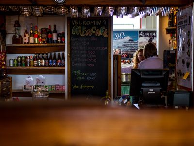
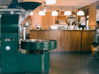
Dunkin' coffee and bar interior at 30th & Market Station, Philadelphia

Specialty Coffee

Single-origin, freshly roasted

Craft Cocktails

Local spirits, seasonal menus

Early to Late

Open when you need us
Two menus. One unforgettable spot.

Whether you're grabbing a quick flat white between trains or settling in for a slow evening with a craft cocktail, every cup and every pour is made with intention.

Artisan latte art at Dunkin' Philadelphia Morning

Specialty Coffee

Single-origin espressos, pour-overs, and signature lattes crafted by baristas who care about every detail — from bean to cup.

Craft cocktail being prepared at Dunkin' Philadelphia Evening

Craft Cocktails

When the sun sets, our bar comes alive. Seasonal cocktails made with local spirits, fresh ingredients, and creative flair.

Fresh pastries and food at Dunkin' Philadelphia All Day

Fresh Bites

Artisan sandwiches, fresh pastries, and snackable plates — perfect alongside your drink or as a quick meal on the go.

Built for the city that never stops — and the people who move through it.

Located right at the heart of Philadelphia's transit hub at 30th & Market, Dunkin' was designed for the commuters, the locals, and everyone in between. We're the place that knows your usual before you do.

Community First

We're not a chain experience — we're your neighborhood spot with a passion for quality.

Quality Without Compromise

From ethically sourced beans to locally distilled spirits, every ingredient is chosen deliberately.

Philadelphia Proud

Celebrating local roasters, brewers, and producers — because the best ingredients come from right here.

Interior of Dunkin' café at 30th & Market Station
Bar area at Dunkin' Philadelphia
Fresh coffee being poured at Dunkin'

Hours

Monday 6:00 AM – 10:00 PM
Tuesday 6:00 AM – 10:00 PM
Wednesday 6:00 AM – 10:00 PM
Thursday 6:00 AM – 11:00 PM
Friday 6:00 AM – 12:00 AM
Saturday 7:00 AM – 12:00 AM
Sunday 7:00 AM – 9:00 PM

Find Us

Address 30th & Market St Station
Philadelphia, PA 19104
Transit SEPTA Regional Rail · Amtrak · NJ Transit
30th Street Station

The best part of your commute
is already waiting.

Whether you need a quick grab-and-go espresso or a place to unwind with a craft cocktail after work, we're right where you need us — at the intersection of 30th and Market.

Is this your business?This is my business